buttons-custom-styling
Buttons Custom Styling
So you have a bunch of Buttons and the built in color options just aren't cutting it. You want to get a little fancier with Button styles. This tutorial will show you how.
1. Change Default Button Styles
Style Settings
The most straightforward way to update how a default button looks is to use the Style Settings plugin. This plugin is awesome and provides a visual editor for styles. I've specifically built in support for Style Settings into Buttons. Once installed and enabled you should see the following options:
Changing these settings will update the styles for all buttons in your vault.
Override .default-button class
Default styling is applied to Buttons using the .default-button class. You can override values in that class using your own CSS tweak.
2. Individual Button Styling
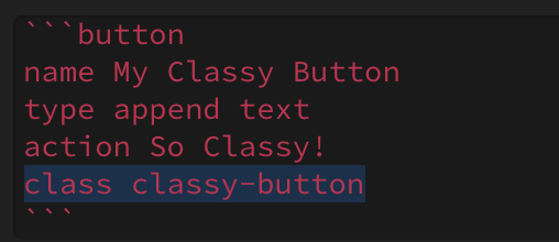
By adding a class attribute to a button you can write custom CSS styles for that button. Here's a step-by-step guide.
- Add
classto the button you would like to style:
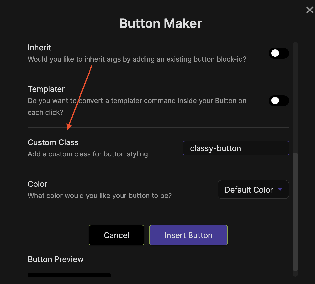
You can also supply a class when making a Button with the Button Maker:
2. Open Obsidian Settings > Appearance and ensure Apply Custom CSS is toggled on:
Locate your CSS Snippets folder and create a new file called custom-buttons.css. You can click the little folder icon to open the CSS Snippets folder:
3. Open custom-buttons.css in a text editor (I like VS Code) and add your custom class and CSS styling to the file. Then Save.
.classy-button {
    background-color: rebeccapurple;
}
- Go back into Settings > Appearance. Click the reload snippets button and then enable the
custom-buttonssnippet.
3. Multiple Classes
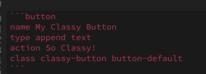
The last thing you need to know is that a button can have multiple classes listed. When you supply a custom class to a Button it strips all the default styling. If all you want is a different background color, this can be annoying. You can re-add the default styles by adding button-default to the class argument:
What happened to our custom color? The styles in button-default is overriding the background color. To fix this, we can add !important to our custom styles:
.classy-button {
    background-color: rebeccapurple !important;
}
And our button should look like:
Conclusion
Hope this helps in getting your Buttons looking perfect. If you spot any errors in the instructions, or have a question. Hit me up on discord @shabegom


